The Word Became Flesh

Jesus: The Word Became Flesh
I created this mixed media reflection as part of my preparation for preaching and teaching the Gospel of John for the season of Lent & Easter. It was done in my small travel journal (3-1/2"x5-1/2") after reading the Gospel of John and reflecting on the significance of this Gospel. I was struck by a phrase I had jotted down in my study Bible after taking an intensive course in seminary on John: "Jesus explains the Logs; not the other way around." A friend had given me a Madonna icon so I used the soft colors in the icon as the theme for the journal reflection.
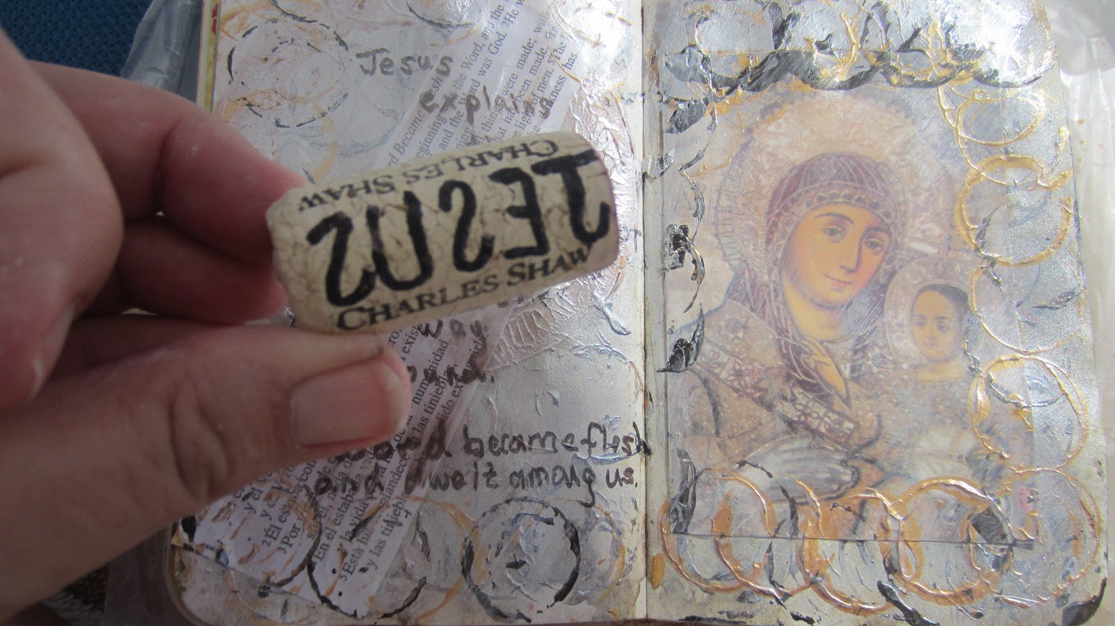
I had prepared several pages with generic backgrounds using different techniques for watercolors. I chose the one with bronze tones because it matched the icon. I stamped circles on the image using gold and black acrylic; glued down the icon on the right page and bi-lingual scripture of John 1:1-5 on the left page. I toned down both pages with a thin coat of white gesso which I topped with pearl acrylic glaze. More stamps using a wine cork for the circle.  
I cut another JESUS wine cork and used that on top of the layers to add detail and emphasis. Finally, I used the B Prismacolor brush tip marker to letter two phrases:
Jesus explains the Logos NOT the other way around.
The Word became flesh and dwelt among us.
 

Colored Pencil Exercise

I like to read through art books in literally every type of media and then create an exercise to experiment with the media. I used colored pencils to add bits of color and to enhance a mixed media image, but I don't generally draw or "paint" images entirely with colored pencils. While I was a passenger during a long road trip I experimented with making an image using colored pencils. I used the photograph barely visible in this photo behind my journal as my referent guide. We had just completed the season of Advent/Christmas so I used an advent wreath as my subject and wrote words around the candles that reflected my recent experience. The point is not to be a "colored pencil artist," but to experiment with something new while reflecting on a particular aspect/experience of life.

Color Wheel Exercise

A great way to learn the color wheel is to paint your own with watercolors. I made this messy color wheel while a passenger on a long road trip. In the version above I mixed the paints before applying them to my travel journal. In the example below I "mixed" the colors in layers on the page as I painted. Watercolor is not my "best" medium, but they are an excellent way to learn how colors mix.

Using Reference Photos for Art

Pacific Coast Highway photo taken with my cell phone Dec. 30, 2012 from our hotel room across the street from the ocean.
Reference photos are an excellent tool for art. Between my cell phone and my Canon PowerShot Elph300 "snappy" camera that I always keep in my purse or my back pocket, I always have a camera available to take quick pix wherever I am. The challenge, of course, is to download the images regularly and file them under key names/tags so you can locate the images when you need them.  I use the following broad topics: composite; enhanced; scenics/landscapes; people; still life. I break these main topics down to subfolders as appropriate with new pictures that I take. For example, under scenics I currently have: animals, dessert, sunset, sky, water, green & growing, and people. These might be broken down into subhead folders. For example, under green & growing I have trees, flowers, gardens.  I used the reference photo above to experiment with pencils in my travel journal the same night I took the sunset photo.
The images might trigger a piece of art while you are taking the photo like the image above, or you might file them away to use in the distant future.
I took the image of the surf along the rocky shoreline with the house in the distance while on a long weekend R&R to Cape Cod. This the image we drove by almost daily for the 25 years we lived on Cape Cod. We hadn't been "back" to the Cape in several years, and we drove around to our favorite spots and took memory pictures. I didn't have time to do anything with the pictures until several months later when we were on our annual winter vacation. I took the printed snapshot with me along with art supplies to try a new technique that I had wanted to experiment with. I applied white gesso to a journal page and embedded bits of wadded up tissue paper in the gesso. Once it was dry I used the reference photo as a guide and painted the image with acrylic paints. I embellished some areas with colored pencil. The project was totally (for me) experimental based upon an idea I had seen by artist Mary Todd Beam. It was a fun project, and I was surprised with the results. For me the
experience is not so much about the end project but the reflective thinking during the art process. In this case, I boldly tried a totally new (for me) art technique and let go of any pressure or expectation to be "good" at it. Also, during the art I reflected on the many joyous memories our family has from Cape Cod and this particular scene that we drove by so many times. While I experiemented with art I was reflecting on GRATITUDE.


Artful Reflection


This simple piece is in the travel journal I took on vacation to Mexico. It was my first vacation in nine years without schlepping along mounds of homework. Instead, I brought a variety of art supplies on vacation but with a limited selection of colors (particularly with the "wet" materials), and a recycled book to make an "altered book" journal. I prepared a generic background on a few pages before leaving home, including the blue acrylic here with the rubber stamping on the right side. Once on vacation I used the prepared pages to start the "muse" for continued art and reflection. Mixing art with theology is very different from a traditional written journal which includes mostly words, often "dumping" the words out without much thought or reflection. In contrast, artsy theology uses very few (if any) words and listening to God through the doing of the art is integral to the artful reflection. The blue here represents the ocean and the serenity of sitting in the shade of the umbrella with no agenda but to be still before the Lord. The shells are from the beach at Todos Santos, and I included three as a representation of Triunity. The message I was hearing through my time of rest was that "a wonderful work of God" is permission to rest, to be still, to listen, and to receive instruction rather than (always) giving direction. The completed journal page is a reminder that I have permission to give myself permission to be still and rest and know that God is God.

Theological Words

Word Box: A cigar box makes an excellent container for custom stamps carved from wine corks and erasers.
Write a word on a piece of paper the width of the stamp or cork. Turn the paper over so it is backlit and write the letters "backwards" on the stampe from right to left. Use a sharp blade on an exacto knife to carefully cut out the letters. Test the stamp on a junk piece of paper before you press it onto your art page. I have a couple of pages in my travel art journal where I stamp the words so I have a record at-a-glance of the words I have already made. I also jot down new words and keep a list of words yet to carve. I can fit five block letters on a wine cork and nine letters on an eraser.
I use the name the logo/name imprinted on the wine cork as a straight line guide. Once I've written the letters I take the exacto knife and carve off the bottom and top lines of the logo and then work right to left on the individual letters. You can use ink pads or acrylic paint.

Time for Art

"Time for Art" is a reflection on how to create time for creating art. Layers include wadded up tissue paper on white gesso topped with acrylic paints; words torn from magazines; music; flowers cut from custom art paper; and colored pencils.
There are various steps in creating a theological reflection as art, but it is not a "step one; step two; step three, etc." process.The art process includes listening to the art during the creation process so the completed piece unfolds. Begin by putting a generous amount of white gesso on the pages and embed tissue paper into the gesso. Allow to dry. Use a sponge paint technique with a large brush to dab color. Here, I used the colors of a vibrant sunset. Exaggerate the colors by enhancing with colored pencils. I read through an art magazine that had been sitting in my "to read" pile for awhile and tore out key phrases that jumped out at me. I also included a piece of music that reminded me of "carpe diem" and sieze the day for this is the day the Lord has made.
While I was listening to God through the art I was reminded of the importance of art in my life and how it had been edged out by busy-ness and the priority of too many other tasks. I was reminded that art takes time and that it is up to me to carve of time and make room for the creative process for both art and writing. Finally, I was reminded that I need to give myself permission to create. These various elements come together during the creative process which combines the technical aspects of doing together with listening to God. The combined process reminds me of sermon preparation with the combination of the academic research into the biblical text together with listening to the Word of God to hear the particular message for preaching. The art of theological reflection ("arsty theology") blends art with listening for an unexpected end result.


Love is Joy


"Love is Joy" is a mixed media reflection on my love for my husband. I worked on this layered image in my travel art journal over several days while on vacation with my spouse in Mexico.

I prepared the background before we left on vacation. I didn't have any particular theme in mind. I was experimenting with usding different materials and colors so that the pages in my art journal would ultimately be very different from each other. The prep includes mauve acrylic glaze topped with stamping the edges with a large background stamp with pink ink. I brought a file folder of pretty papers in my travel art kit and cut heart shapes and glued with fluid matt medium.
Layers: music, a love poem, bubble wrap painted with mauve acrylic glaze.

Layers: heart shapes, Bible verse about love.
Layers: custom stamp made out of styrofoam and filled with acrylic.
 
Layers: a love letter to my husband written as "stacked journaling."
 
Layers: custom carved stamps made from wine corks.


The Great Divide


"The Great Divide" is my theological reflection in an altered book art journal from my two week vacation to Los Cabos. I spent a day at Mision Alfa y Omega in one of the barrios. As we were leaving I noticed something that I had not realized in previous visits to this same location: it is possible to visually see the resorts areas from the barrios in Los Cabos, Mexico; yet the barrios are a world apart. One of the great barriers is language. English is the dominant langauge for the Cabo tourist areas, but persons born into abject poverty have limited opportunities to learn English as a second language.  It can be spiritually and emotionally draining to flip-flop between the affluence of the tourist district and the poverty of the barrios. I created "The Great Divide" as a way to process the stark contrast between the two worlds.

I chose a few words to leave exposed and then painted black gesso on two pages of my altered book art journal. Then I drew a representation of the barrios on the bottom half and the resort area on the top. They are separated by a wide line that represents the main street in the tourist district.

I used colored pencils to color all but the black "street" and the words.


Quickly and carefully rinse off the soap. Blot with paper towels to dry.