I've included symbols that tell key stories: elements of creation; an Apple on the tree of life and "choose" signifying free choice; ABC stenciling and the Tower of Babel; rainbow and God's promise to Noah not to flood the earth again; stars (upper right) for Gid's promise to Abraham that his descendants would be as numerous as the stars; stenciled circles (bottom right) for the abundance of the offspring now living in Egypt.
Showing posts with label oil pastels. Show all posts
Reflection on the Theology in Genesis
An assignment for a university course I'm teaching this summer on the Old Testament includes the requirement to produce an AV that tells the story of the Old Testament in 5-7 minutes. I'm doing the project simultaneously with the class.
Oil Pastels & Stenciling
I bought some fun stencils from Artist Cellar & I decided to play with them as a stress-reducer no-particular-reason art fun session. Instead of my normal watercolors or acrylics I opted for total experimentation with oil pastels and Crayola Twistables.
It definitely glops it on thick and messes up the new stencil! (But good news it easily washes mostly clean with 99% isopropyl alcohol.). Of course the thick glop adds texture (but it'll take awhile to dry).
The Hand(s) of Prayer
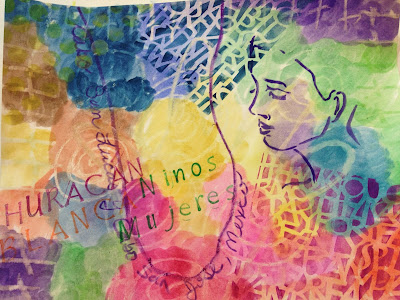
My sample evolved to be prayers for the women and children in Cabo as Hurricane Blanca nears. |
White crayon on watercolor card stock. |
Materials:
1.
Watercolor paper
2.
Watercolors and watercolor pencils
3.
Paintbrushes
4.
Crayons and/or oil pastels
5.
Stencils
6.
Stamps and stamp pads
7.
Colored pencils
8.
Cups for water; pitcher; paper towels
9.
Hair drier (to force dry watercolor)
Process:
1.
Rest one hand palm side up on a piece of
watercolor paper and use a white/light colored crayon or oil pastel to draw the
hand. The palm-side-up hand symbolizes an open prayer. As desired, add a border
and/or symbols in the remaining space of the watercolor paper.
2.
Use one or more colors of watercolor to
completely paint over the paper. During
the painting process think of the people, events, circumstances that you want
to include in the art prayer.
3.
Allow the watercolor to dry (or use a hairdryer
to force the paper dry).
4.
Use stencils and/or stamps to add the names of
the people, events, and/or circumstances to your prayer.
5.
Title the prayer. Put your name and date
somewhere on the page—either on the front or on the back.
Dance of Freedom
There are multiple layers in this jounal entry which expresses my prayer for women & children who are incarcerated in a nearby family detention center. I started the art journal after spending a day inside Karnes City Detention Center where 500 immigrant women & children are being held. The first layers are unrecognizable in the final piece, but the first layers provided important reflection time to help me to process the experience.
I used a stencil of the USA and spritzed with watercolors. It symbolizes the diverse locations across the USA where the women have family and hope to go.
I had been stuck on how to finalize the reflection until I saw this page in one of my stacks of art books. The imagery of women dancing captured the essence of my prayer for the women at Karnes. I chose a piece of art paper from my stash and cut free-hand the shapes of the women dancing. I may add something more. But for now it is mostly done.
Roots and Wings
Oil pastel with a stencil. (This will take a LONG time to dry!) |
A Spiritual Place
Sometimes my art journal is simple a place to experiment with new art materials and/or art techniques; other times I use it to "doodle" with ideas. Ultimately, each art journal becomes a record of my thoughts, feelings, ideas, and reflections over a given period of time. Some entries are more profound than others; some are more "artistic" than others. It is during the discipline of consistently sitting down with my journal for self-expression, listening, planning, prayer, and putting "brains on paper" that I am able to "process" what is happening in life. When I go through stretches where I do not make/take time to diddle in my art journal, I realize later that I've usually missed a piece of my life. It is the slowing down and artfully reflecting which helps me to identify, appreciate, and better understand the people, places, ideas, and activities in the too-busy-world around me.
In an altered book, I covered the right side of the page with white gesso and the left side with clear to show the crosses. I experimented with water soluble pastels (bottom layer) and oil pastels (top layer) to make the crosses on the right. Water and a cotton swab or brush easily spread the water soluble pastels. I used 99% isopropyl alcohol (available by special order at your local pharmacy) and a paint brush to spread the colors on the oil pastels.
A few weeks later, after doing the crosses and the basic background, I was skimming through my sermon journal and I came across notes from one of the pastors in my study group. I saw a few doodle notes from a side path we'd run down while reading the scriptures for the upcoming Sunday.It is a theme I want to revisit with the leadership team at my church-and it goes with the theme of this journal page-so I added the doodle note in this journal entry for possible future art/reflection and also to remind me that this is a conversation pending with my leadership team.
In an altered book, I covered the right side of the page with white gesso and the left side with clear to show the crosses. I experimented with water soluble pastels (bottom layer) and oil pastels (top layer) to make the crosses on the right. Water and a cotton swab or brush easily spread the water soluble pastels. I used 99% isopropyl alcohol (available by special order at your local pharmacy) and a paint brush to spread the colors on the oil pastels.
Oil pastels spread with 99% isopropyl alcohol. |
A few weeks later, after doing the crosses and the basic background, I was skimming through my sermon journal and I came across notes from one of the pastors in my study group. I saw a few doodle notes from a side path we'd run down while reading the scriptures for the upcoming Sunday.It is a theme I want to revisit with the leadership team at my church-and it goes with the theme of this journal page-so I added the doodle note in this journal entry for possible future art/reflection and also to remind me that this is a conversation pending with my leadership team.
Mixed Media Background Quickie
When you don't have time to "do" art, it is always fun to slap some paint onto a background so it is ready for when do have time to do art. This mixed media quickie is in an altered book journal. The pages had already been prepped with white gesso and one layer of blue acrylic glaze which had been applied with the stippling technique and a #14 round mop brush. To this I made a "picture frame" with blue and yellow Neocolor II water soluble wax pastels. Then use a 3/4" flat brush dipped in clear water to smush the lines. Pick up a little color from the wax pastels and spread it across the page as desired. Next I used a screen to create the diamond grid pattern. This screen is generally used in a tub of house paint to run a roller brush back and forth and drain the excess paint before applying to an interior (house) wall. I used two shades of yellow and one shade of blue watercolor; pressing down hard on the screen to hold it still while I quickly ran the brush up and down across the screen. The entire project took 15 minutes. Voila! A mixed-media background for future use and a brief expression of creativity amid a hectic day. (An art version of a brief midday break for yoga.)
Birthday Flowers
I tried (and failed) to do an image transfer photograph of my birthday flowers onto encaustics. Then I tried and failed to adhere it as a photograph. I used the second failed attempt as a template, cutting around each portion of the flowers and then edging a groove outline onto the plain wax of the page. Then I used oil pastels, Pan Pastels and colored encaustic paints to record the birthday flowers (a lily and a tulip) on the right side. I did a "mirror image" hand colored B&W on the left.
It was an exercise in appreciation: for my flowers.
Grooves outline the shape of the flowers. |
Oil pastels on the tulip. |
Pan Pastels on the lily. |
The left page is a hand colored (pencils & pastels) on plain laser printer white paper. |
True Meaning
Doing art journaling with encaustics is an excuse for a mixed media experiment which encompasses multiple layers and materials. First, of course, encaustics "should not" be used in an art journal because they require a firm, porous surface. However, I figure that the same experimenting with mixed media in a journal ought to be extended to this media as well. I prepped the pages with encuastic gesso and am dedicating the right side of each spread to encaustics and the opposite/left side to generic mixed media (so the pages won't stick together wax-to-wax.
It is particularly challenging for me NOT to use words in my journal reflections because I am quite simply a "word person." The wax paints limit the amount of writing that can be included which has made it a helpful tool for me to "do" art without (very many) words. This spread began with exposed words "True Meaning" which became the (internal) reflection during the art process. I masked the headline area and used Pan Pastels to add orange.
Because I cannot use encaustic paints on both sides of the page, this spread became an experiment in "what do do on the left" compared to the encaustics I planned to use on the right. To tie the pages together visually, I used the same rug craft product (Hobby Lobby) with acrylic paint on the left and encaustics on the right. Once the rug fabric was removed, I added more layers of acrylic to the left and more layers of encaustics to the right.
Pretty papers which are somewhat porous blend well with encaustics. Once layers of clear wax have been applied, I used a wooden tool used to scrape clay to lift out the wax in the leaf pattern. This gives depth to the image and provides an easy play to add color back in with a gold oil pastel. I also added tiny seed beads in the top portion; use a heat gun to soften the wax and then gently push the beads to embed them in the wax.
Add acrylic on top of wax. |
Seed beads embedded in the wax. |
Carve out the wax to add depth. |
Oil pastels work excellent with encaustics. |
I feel like I need to add something to the left side (words!!), but I'm letting it go and leaving it alone...for now. |
Product Testing & Recording Color Selection: Oil Pastels
I'm a mixed media artist because I haven't seen a medium that I didn't like; couldn't wait to get my hands on to experiment with. Unfortunately, of course I (impulsively) collect an eclectic mix of supplies that (sometimes) get stuck in drawers and go unused...for chunks of time. I also tend to forget which colors I have of which media, so it's easy to duplicate when I'm visiting a city which has a FABULOUS art supply store (Hobby Lobby is "it" in my city), or, worse, not buy anything at all for fear of duplicating an existing color. Problem solved: in my "Backgrounds Practice Journal" I've created pages which which compare brands and/or include a sample of each color choice within a particular type of media. For some, I did the sampling on white and black gesso; others only on white or the plain journal page.
High maintenance need to remove dry skin before each use. |
Annoying need to cut off dry skin. |
Very pretty super smooth application. |
Slow to dry but great versatility in application. |
Inexpensive and wide color selection; but SLOW to dry. |
Inka maintained the most vibrancy on the black gess. |
It's obvious why these are the least expensive as soon as you compare to the others. |
Inka goes on like shoe polish with a rag; little bit messy but good for wide spread. |
Four types of oil pastels on white gesso. |
Sennelier scored points for variety of colors & ease of application. |
Shiva scored points for drying faster than the other brands. |
Subscribe to:
Posts (Atom)