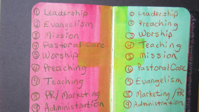
Color Adds Visual Element to Basic Journaling
During the return trip from visiting extended family in California during Christmas used my travel journal to help focus in on where I had been spending my time compared to how I needed to (re)prioritize my time to help facilitate the church's growth. First I brainstormed the various job headings for the major ways that I currently spend my time, and then I reorganized it based on leading for growth. I used the simple colors of the traffic light as a watercolor wash to add a visual element of how I needed to stop prioritizing my time (RED) compared to the new organization for GREEN and growing. Yellow in-between is the visual caution that the changes cannot, should not, and will not be made instantly, but rather there will be a transition from the red list to the green.
