Stacked Journaling as Sermon Preparation

During the course of Reading the Bible in 90 Days and fast-forwarding through I & II Kings and I & II Chronicles in the Old Testament during one week of reading, there was so much information to process and ultimately distill for a Sunday morning sermon that I opted to break it down in layers of "stacked journaling" (an art technique advocated by mixed media artist Judi Hurwitt). The readings covered the sweeping history of the various kings of the Israelites from King David until the exile to Babylon. It was a lot of material to read and process for just one sermon, but I was struck by one sentence in II Chronicles 20:15:
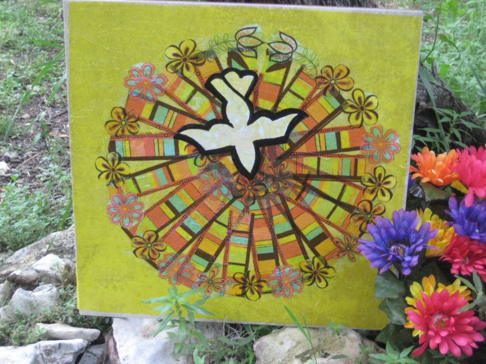
"Do not be afraid or discouraged because of this vast army, for the battle is not yours but God's." For the art reflection, I chose previously prepped pages with the exposed words "Remain in me, as I remain in you" because it is a New Testament verse that complements the verse in II Chronicles. I began by writing the verse from Chronicles 20:15 in large letters. Next I added words in stamped letters diagonally up from the bottom. These represented my current "battles."
 I was struck by the common theme of the "bad kings" vs. the "good kings" covered over the 112 chapters of scripture. Essentially, the kings were measured by whether or not they led the people to live according to the Shema in Deuteronomy 6:4 ("Hear, O Israel: The LORD our God, the LORD in one...."). I switched to silver ink for stamped words expressing the Shema and purple ink to contrast covenant faithfulness as expressed in Deuteronomy with the New Covenant in the Gospel of Luke 22:20. Identifying key themes and their appropriate scriptures became a springboard for preaching and teaching a massive amount of scripture for a 20-minute message. Next, I opened my sermon journal and expanded on the key themes from the stacked journaling reflection, organized the order of texts to include for the sermon, a noted a few key thoughts for the closing comments.


Hand Map


A collage made in the shape of your hand is a fun project for children as a way to visually identify their unique gifts. We used the project as a page in the VBS art journal. Begin with a piece of watercolor paper cut in a size to fit the book (or other project) and watercolor the entire page. Allow to dry. On a separate piece of stiff white paper draw around your hand with a dark pen or pencil. Cut out bits and pieces from magazines which illustrate your gifts-using both pictures and words. When the entire hand is covered cut out shape of the hand (you should be able to see the original hand marking on the underneath side of the thick paper). Glue the hand in place. Then write the story of the pictures and words around the outside of the hand. As a closing exercise as the children to share what they learned about the unique way that God created them.

Sheetrock Paste and Corrogated Cardboard


 We used corrugated cardboard for the book cover for during summer VBS. Then each day the children created a page for the book using a different art technique to illustrate the day's teaching theme. Have the covers prepared ahead of time: spread sheetrock paste on the "front cover" of the book binding and use a sharp object to draw the lettering on the cover. "Great Expectations" was our theme, and here I experimented with the theme as the title or the name of the participants. (We opted for the theme as the title so all the sheetrock prep could be done ahead of time.) Allow to dry. Use fine sandpaper to sand some of the roughness on the cover. Then it is ready to decorate with watercolor paints (below) or pastels (left side of the top left photo). Use a light coating of matte or lustre spray to seal the cover.


Wax Relief is Empowering Art for Children


Wax relief can be the basis for a variety of simple art projects for children. We had the VBS kids make greeting cards to send to men and women serving overseas in the armed forces. First, the kids use crayon to decorate a piece of watercolor paper. They can use words and/or decorative art (far left). Then they paint a wash of watercolor over the top and the crayon creates a wax relief. After the front is dry, have the children write a letter and decorate the inside with rubber stamps or additional art.
The same concept works to illustrate a page in a book that the children created during summer VBS to illustrate the biblical theme they had learned. We read the story in 1 Kings 5:1-14 of the little servant girl and the proud general (Naaman) who had leprosy. The older kids used words (humble/pride) & the little ones used art (sword).


Wax relief creates beautiful instant art that makes the children feel very empowered and proud of their artistic ability. (Actually, the same empowerment happens for adults with this simple, yet lovely, art technique.)

Ceramic Tile Art

Ceramic tiles are great for disposable outdoor art to decorate a seasonal theme. I buy the discontinued styles at Home Depot which are dramatically discounted. I made three "Holy Spirit" 18"x18" tiles with cut out pieces of pretty paper napkins and bright colored tissue paper. Use a thick layer of Mod Podge to coat under and over the paper for durable outdoor art...for a season. These decorated Way of the Cross during Holy Week.


 You can find copyright free designs on the internet to use as guides for specialty shapes such as the dove descending (right) and then be creative with how you cut portions of party napkins. These tiles also can be used for lettering quotes, sayings, and scripture passages (below). Enlarge the words in the typestyle of your choice and then transfer the letter using traditional carbon paper. (Place the carbon face down on the tile, the lettering face up, and use a blunt pencil to "write" over the lettering to transfer it to the tile. Paint over with acrylic paint; coat with Mod Podge to enhance longevity.

 We also glue pictures on the tiles to illustrate themes for Way of the Cross, such as the pictures taken on a mission trips to Guatemala and Zambia, Africa (below). The same concept works for what I call "schlep art," which is disposable art "schlepped" together quickly which will be used for a short period of time, such as the "seven signs" in the Gospel of John (bottom left) used to illustrate a station in Way of the Cross. Kids like to make ceramic tile art, so it is a natural for VBS (bottom right).


Theological Reflection with Rocks

Rocks are an abundant natural resource on the church property so we look for creative ways to use rocks at the free raw material for various art projects for VBS and for special services of worship during the year. The fruits of the spirit from Galatians 5:22 (left) were painted by the confirmation class and used to decorate one of the stations of Way of the Cross during Holy Week. The rocks were painted with watercolors; allowed to dry, then the word was painted on using acrylic and then the rock was coated with Mod Podge to stabilize the paint. A similar concept was used on Way of the Cross (below) where the rocks were painted white and the lettered with permanent markers. Acrylic paint is another option (bottom); it is more vibrant and stable but the paints cost more.
 
 kids love to paint rocks too, so it is a natural for VBS. The kids made paper weights and painted their rock with watercolors (left); then the adults lettered PEACE (below) on each rock to remind the children of the PEACE of Jesus.

1 Corinthians 13: Peace, Hope, and Love...and the greatest of these is LOVE.

Peace: Beauty of Baja


Memories can slip away unless we slow down and name them through art and/or journaling. I had the unexpected blessing of spending a week with my (new) daughter-in-law when she joined our mission trip to Mexico. I wrote down the key words and phrases that described our time together. We share purple as our favorite color, so I used that as the theme color for the background, words, and flowers made out of encaustics which represent the beauty of the Baja plus the beautiful time we spent together.  I chose exposed words from a previously painted with white gesso page which also expressed the joy of our growing relationship.
I also included scrapbook items from the trip: a map a few phrases torn from tourist publications, and a snapshot of us together. I toned down the brightness of the words and encaustic flowers on the two pages (left) with a layer of pearl acrylic glaze over all (below). I wanted to choose one key word that expressed my experience-one BOLD TYPE word that summed up the time spent with my daughter-in-law. I painted PEACE with three layers of acrylic glaze, using an increasingly slightly wider flat brush. The finished journal page isn't about "art" or "theology" but about a beautiful (growing) relationship. It is encouraging to experience the presence of the peace of God in relationship, which is what this reflection names: PEACE.


Mixing Acrylic and Photography

Exposed words "we are reminded not to give up" set the tone for this mixed media reflection.

Dollops of acrylic on a page covered with white gesso.
 
Paint spread with a Catalyst rubber "brush"


Scrapbook items glued down with artist matt medium while on a mission trip in Mexico and composite images added later Stateside: the dominant image of the church is 2/3 photograph (left side) and 1/3 acrylic (right) with the trees added in acrylic. The goal was to recreate the majesty of the historic church in Todos Santos with the three-dimensional beauty of the majestic trees that lined the front walkway. The park benches (far left) emphasize the overall feeling of quietude and serenity.

The mixed media exercise in blending photography with acrylic was, for me, an experience of empowering freedom in combining what I am familiar with (photography) with that which I am less comfortable (acrylic) for the sole purpose of expressing the feelings of a day of R&R in Todos Santos, Mexico.

Different Angles

 Use vacation time to experiment with camera angles, composition, and varying between horizontal and vertical images. The wonderful thing about digital is that you are using "free film." Take a ton of pix from a variety of perspectives and then choose your favorites when you download your pictures at home mas tarde.

I used different camera angles-inside and outside-to capture the essence of this historical church in Todos Santos, Mexico. The bright overcast light provided ideal lighting for the exterior photos. I plan to "stitch" the photos together as time permits for a journal reflection on our time in Todos Santos.


For Future Reference

An off-season mid-week side trip to Todos Santos in June turned out to be an excellent opportunity to stock up on reference photos...for future reference. While my mission team walked around the small town buying souvenirs on our day off during a recent mission trip to work in the barrios of Los Cabos, Mexico, I  floated around with my "snappie" (Canon PowerShot Elf that fits in my back pocket) and took a myriad of pictures which I could file away and use for future art projects and journal reflections. The "June gloom" which makes for "bad beach days" as the thick fog hoovers along the cost during the morning creates bright overcast light just inland-excellent for stock photos of virtually every angle. In addition, the off-season timing made the streets virtually deserted of tourists so it was easy to snap away and create "working souvenirs" for future art reference.


 A cubby set back into an exterior wall would have harsh areas of highlight and shadow if the sun had been shining. The bright overcast light provided virtually even illumination within the cubby and captured the bright and colorful designs of the pottery. The courtyard overview of a boutique hotel shows soft shadows as the fog had burned off but the sun was screened through soft clouds.


Mission Team Reflection

 It is fun to mix simple art with reflection. Instead of straight-up note taking or straight-up jotting down ideas following a small group meeting, integrate the ideas discussed with simple line art and/or doodles that capture the essence of the meeting. This is a reflection following a team meeting during a recent mission trip to work in the barrios of Los Cabos, Mexico. The line art shapes represent the seating arrangement and the themes/questions raised by the various persons present. It was a quick reflection done on top of an already prepared background. I choose the exposed words which reflected the main idea behind the meeting as diverse people and ideas came together to learn from one another. Much of the conversation was about jewelry-making as cottage industry and empowerment for women in the barrios, so I decorated the page with assorted earring designs that we had made with the women during the mission trip.
Clip-art words cut from tourist magazines and glued on.
Previously prepared background with exposed words.