Birthday Flowers

I tried (and failed) to do an image transfer photograph of my birthday flowers onto encaustics. Then I tried and failed to adhere it as a photograph. I used the second failed attempt as a template, cutting around each portion of the flowers and then edging a groove outline onto the plain wax of the page. Then I used oil pastels, Pan Pastels and colored encaustic paints to record the birthday flowers (a lily and a tulip) on the right side. I did a "mirror image" hand colored B&W on the left.
Grooves outline the shape of the flowers.
 It was an exercise in appreciation: for my flowers.
Oil pastels on the tulip.

Pan Pastels on the lily.

The left page is a hand colored (pencils & pastels) on plain laser printer white paper.


True Meaning

Doing art journaling with encaustics is an excuse for a mixed media experiment which encompasses multiple layers and materials. First, of course, encaustics "should not" be used in an art journal because they require a firm, porous surface. However, I figure that the same experimenting with mixed media in a journal ought to be extended to this media as well. I prepped the pages with encuastic gesso and am dedicating the right side of each spread to encaustics and the opposite/left side to generic mixed media (so the pages won't stick together wax-to-wax.
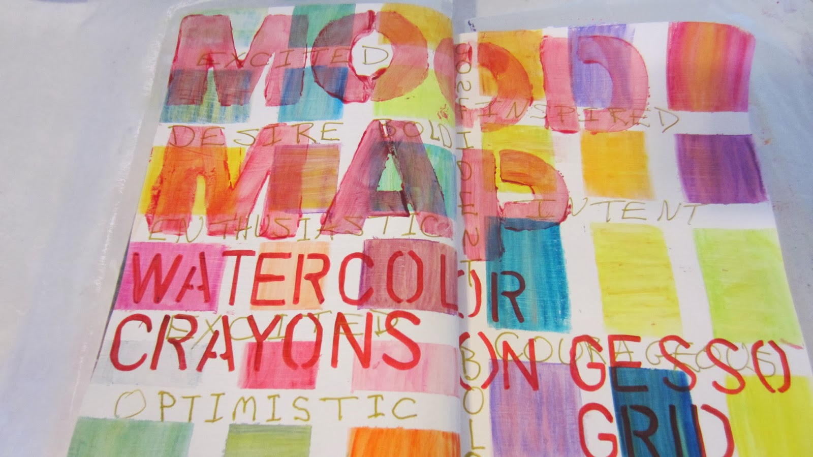
 It is particularly challenging for me NOT to use words in my journal reflections because I am quite simply a "word person." The wax paints limit the amount of writing that can be included which has made it a helpful tool for me to "do" art without (very many) words. This spread began with exposed words "True Meaning" which became the (internal) reflection during the art process. I masked the headline area and used Pan Pastels to add orange.
 Because I cannot use encaustic paints on both sides of the page, this spread became an experiment in "what do do on the left" compared to the encaustics I planned to use on the right. To tie the pages together visually, I used the same rug craft product (Hobby Lobby) with acrylic paint on the left and encaustics on the right. Once the rug fabric was removed, I added more layers of acrylic to the left and more layers of encaustics to the right.
 Pretty papers which are somewhat porous blend well with encaustics. Once layers of clear wax have been applied, I used a wooden tool used to scrape clay to lift out the wax in the leaf pattern. This gives depth to the image and provides an easy play to add color back in with a gold oil pastel. I also added tiny seed beads in the top portion; use a heat gun to soften the wax and then gently push the beads to embed them in the wax.


Add acrylic on top of wax.

Seed beads embedded in the wax.

Carve out the wax to add depth.

Oil pastels work excellent with encaustics.

I feel like I need to add something to the left side (words!!), but I'm letting it go and leaving it alone...for now.


Actuality, Freedom, Possibility

Recently when I was digging through piles of spiral binders and file folders of class notes from my "undergrad" seminary degrees, I uncovered a handout from the pastoral care class, "Helping Parishioners Envision the Future" by Andrew Lester and Howard Stone. The authors referenced Danish philosopher Soren Kierkegaard's understanding of persons as possessing actuality, freedom, and possibility. The trio of words are ideal for art journaling and reflection. Actuality includes past actions, context, choices we've made, and our physiological condition/limitations. Freedom deals with the present opportunities but based in the reality of choices/limitations from our past. Possibility is the springboard forward with new options and new opportunities, but it is centered in the reality of the past/present. So, given choices I've made in the past and given the realistic limitations of my present life, what are the opportunities for possibly creating a new future.
The art part was a spin-off of the Mood Map (see previous post) and began with masking a page and using watercolor crayons to color each of the blocks. I also identified my moods & feelings and wrote those in the white (unmasked) lines. I stenciled ACTUALITY, FREEDOM, and POSSIBILITY to remind me of these terms and also to be a future visual of this reflection combination. The questions for each themed word are open-ended and intended to spark thought for ongoing reflection.The "answers" also could be added as another layer on the journal page.
Use multiple layers of watercolor crayons.


Identify your moods & feelings in your present context.

Chapter 4 from Strategies for Brief Pastoral Counseling, ed. Howard W. Stone.

Mood Map

As I continue to experiment with various mixed media materials, I also am experimenting with methods and prompts to think reflectively. The background for the "Mood Map" is a grid made from artist masking tape on white gesso and then each block colored with Neocolor II Water Soluble crayons. After the 2-3 colors were laid down and blended with a clean, wet brush, I added the "mood words" that describe my current perspective on...life. The exercise is meant to raise awareness of the feelings you are experiencing and provide a visual barometer.
Begin by with white gesso on a journal page spread then use artist tape to mask off a random grid pattern. Color each block with water soluble crayons (or other media). Add a second or third layer. Experiment with combining colors and/or using different brushes/strokes. Allow to dry between colors, but go back with 2nd and 3rd colors to build up the color. During the painting process, think reflectively about your context: where you are; who you are; what your goals are, etc.
Adding a second layer of water soluble crayon.

Masking with tape keeps the edges sharp and creates a mini canvas.
 When you are satisfied with the painting, carefully pull up the tape. Use the blank spaces created on the grid to fill in your feels/mood. It can be a surprising exercise and very revealing to what you are experiencing. Date the page.
Artist tape pulls up clean & neat; masking tape isn't as predictable.

I used a list of feeling words to guide my reflection and ID my feelings.

Product Testing & Recording Color Selection: Oil Pastels

I'm a mixed media artist because I haven't seen a medium that I didn't like; couldn't wait to get my hands on to experiment with. Unfortunately, of course I (impulsively) collect an eclectic mix of supplies that (sometimes) get stuck in drawers and go unused...for chunks of time. I also tend to forget which colors I have of which media, so it's easy to duplicate when I'm visiting a city which has a FABULOUS art supply store (Hobby Lobby is "it" in my city), or, worse, not buy anything at all for fear of duplicating an existing color. Problem solved: in my "Backgrounds Practice Journal" I've created pages which which compare brands and/or include a sample of each color choice within a particular type of media. For some, I did the sampling on white and black gesso; others only on white or the plain journal page.


High maintenance need to remove dry skin before each use.

Annoying need to cut off dry skin.

Very pretty super smooth application.

Slow to dry but great versatility in application.

Inexpensive and wide color selection; but SLOW to dry.

Inka maintained the most vibrancy on the black gess.

It's obvious why these are the least expensive as soon as you compare to the others.

Inka goes on like shoe polish with a rag; little bit messy but good for wide spread.

Four types of oil pastels on white gesso.

Sennelier scored points for variety of colors & ease of application.

Shiva scored points for drying faster than the other brands.


Life is a Journey Index of Ideas

 The finale touch for any art journal is an index whereby you put a page number and title of each journal entry. Sometimes I allow more space than others; here I had already done encaustics on the inside-back page of my journal so it was impractical to do a double-page index to summarize the art journal. Instead, I crammed all the details on the left/single page. This simple index is marker pens on white gesso. Under each heading, I included the types of media used for the journal entry. This helps me to skim through the list to find entries which use whatever media I'm searching. Also, often I cannot remember what I named a journal page, but I can/do remember the various materials used to create the page. The grand finale is to find some place to note the completion date of the journal. Sometimes I include this in the index, and other times I note it on the inside front cover underneath the date where I began the journal.
Encaustic with rice paper embedded and topped with more encaustics.

Journal Spilling Dates Are Good

Choose a topic, event, person, or place and use your journal to "spill" all your thoughts, ideas, feelings, experiences related to what you have named. This example is "journal spilling" on the specific activities I did with my husband on our 48-hour date weekend to Cabo San Lucas. We had two days (Saturday & Sunday) to cram the R&R that we have previously leisurely had over two weeks; not two days. The exposed words on the altered book page "Acknowledgments" and "Staying in Touch" were the catalyst for the reflection and "journal spilling" about our date weekend which brought a favorite expression of mine to mind: DATES ARE GOOD. We often list our "top 10" best and least favorite memories when we take a significant plane or road trip. That tradition helped me to begin by naming the blessings of this short trip in the middle of the page. The brick pattern emulates the patio outside our hotel room, and the flower sandwiched between thin pieces of art paper and glued as an embellishment is the Esperanza (hope) flower my husband brought me from one of his his early morning hikes on the bill behind the hotel. Collectively, after spending time spilling and artsying up the pages, I was struck with the significance of time together--even much shorter than our usual/what we would have preferred--was SACRED SPACE. Journaling reminded me of the important of time together, and also has become a visual memory of that beautiful time.
Exposed words in an altered book.
Esperanza flowers sandwiched/glued  between art paper.


"Brick" shapes carved out of wine corks and used to imprint acrylic in a brick pattern.

The overall theme: SACRED SPACE painted with watercolor & a stencil.

Magazine Headlines Can Guide Thoughtful Reflection

Next time you are stuck for how to begin a journal page, grab a tourist magazine and start clipping out headlines that grab your attention for whatever reason. Go through the clippings and see what themes seem to be speaking to your spirit. What jogged your thought process? What moved you to cut out a particular headline? From the common stream that emerges put together a series of headlines to create a unique piece of prose.
 For this example, I was on vacation in Mexico, and I cut out the headlines from two tourist magazines. Of course the common theme for both was VACATION, but I was thinking reflectively about what I want to do and be when I grow up...so to speak. As I picked through the pile of headlines that I'd clipped out, a common (future) theme emerged for my life & I glued the headlines in my journal. Part two of the process is to take the lessons learned/ideas generated from the process of reading, clipping, selecting, and gluing, and "MAP OUT" the necessary actions you feel called to take as a response to your reflection. The MAPPED OUT response helps to synthesize the thinking and move it from the abstract/ideal to the actual/real.
"Mapped Out" is the action process for response.
With your reflection theme identified, name the specific actions of response you need to do.


Subtracting Text Provides Focal Point for Reflection

Subtracting text from the printed page of an altered book is a focal point for intentional, thoughtful reflection. I start from a random page-chosen for no particular reason-and then slowly read and re-read and look for words that jump out at me; marking through all the excess words. I don't go into the reading with anything special in mind to "think about," but remain open and fluid to what the words bring to my mind.
 Somewhere in the middle of the repeated readings a theme emerges in my thought process-connecting the readings with what is going on in my life. I string together a selection of the remaining words into the message that has been jumping off the page and into my spirit. In this example the background is sponge painted watercolor on white gesso. I used stencils and marker pens to letter the words on the right page, and I added a collage of colorful papers as a visual doodle.