Practice Makes Perfect

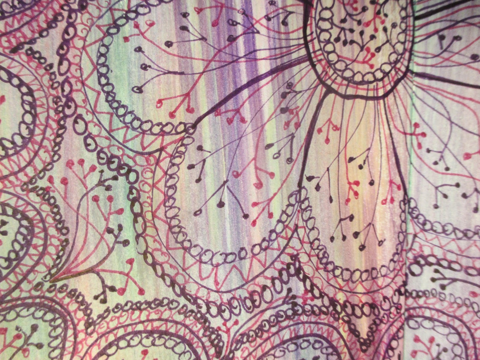
A great way to learn a new art skill is to to follow the examples of those who have gone before you. It is not "copying" for the sake of not having an original thought of one's own; rather using their examples to help the new art skill set become one's own. This learning process is normative for children learning to tie their shoes, write their letters, and read "Run Spot run!" The same concept holds throughout life as we learn new life, vocational, and education skills. One of my artist friends regularly challenges herself to "copy" with colored pencils or charcoals a photograph that she sees in a magazine. She does it simply to keep her art skills sharp! In the example here I am following the lead of Kass Hall in her book "the Zentangle untangled workbook" for a design she calls "Stixnstonez Color." In addition to providing relaxing doodling in the quiet of the evening, it also is a tangible way to experience a new (for me) art style. From the somewhat brainless doodling I will ultimately absorb this art style into the myriad mixed media collection in my artistic tool bag such that I expect Zentangling to sneak into my mixed media art journaling as it bubbles forth.

Micron pens for the Zentangle with the broad color filled in later with watercolors and a brush.

Evening Doodling with Zentangle

At the end of the day when the house is quiet there is an open opportunity to do just about anything, but in the quiet evening after a hectic day sometimes I just want to do...nothing! Silence and nothing. Since doing nothing is completely counter-intuitive for my high type A busy-busy-busy personality, sitting and doodling with Zentangle is about as close to doing nothing as I can get (doing watercolor washes for backgrounds in an art or sermon journal is a close second). I keep a small journal handy and a box of micron pens and zendoodle away. I'm finding that I like using colored pens on pages which have been previously painted with 2-3 colors of watercolor. I've also realized that I prefer curved or circular doodles over against anything more geometric in shape, mostly because the geometric shapes require more accuracy and that is just more work than I feel like doing after a long day. The curved and circular shapes are much more relaxing to create and to look at.

From Rough Journal to Art Journal

I'm a firm believer in having something to write on handy at all times. I generally have some sort of rough journal available to write notes or to sketch out an idea. I may, or may not, do something else with the rough idea but I need to know that I have a ready place to at least put down on paper the beginning of my ideas. In this case I had my "mission journal" with me during a service of worship at the end of day #1 of serving at a relief center for immigrants entering the country in south Texas. Since I am now a pastor vocationally, it is always fun to be a member of the congregation (and not the pastor leading worship), so I enjoy taking notes of what is being said and done. I took notes during the sermon (left) and later embellished with a cut shape (sunflower) which became the beginning of a concept for a more formal art journal entry.
I began in my art journal on a previously begun page...I look for something that I've started that resonates with what I'm thinking about now. In this case, I'd been doing art with immigrants so it made sense to add to a page where I'd already collaged memorabilia about being an artist (below left).
The theme of the sermon was the "Golden Rule" and "do unto others as you would have them do unto you." Essentially, the pastor said that "our life is the standard" and that whatever we want or desire for ourselves is what then we must be willing to help ensure that others are about to have. The pastor challenged the congregation to make a list of what "we" desired and that then became the standard for what others should also have available. I've been on a "sunflower theme" lately as that represents my childhood home (Kansas) so I used the petals on the sunflower as the "list" of what I want.
I used stamped lettering to write the name of song that had been sung. The brown scraps on the right are torn pieces of paper in the shape of tears, and the represent the tears of the immigrants we had visited with earlier in the day. Of course, the stamped image of the cross symbolizes...life and love and hope and commitment.  

Expressing an Experience in Ministry: Food, Clothing Shelter

I spent three days working at a relief center for immigrants entering the USA in south Texas, and it was an intense experience to hear the stories of these wonderful people from El Salvador and Guatemala who are literally fleeing for their lives. Our role was to provide art materials and an opportunity for the immigrants to express their experiences so that the art might be an international public voice of the flight/journey from homeland and family to this funny foreign country called the United States. I asked my participants to express their experience through art journaling. I chose a partially begun journal page (left) which had a sunflower collage with the stenciled words "Life is difficult, that's what life is about. It provides the opportunity to grow as a family and to grow in faith." The sunflower is the state flower of my home state (Kansas) and represented the homeland theme of the immigrants. Of course, the statement on challenge completely resonated with the experience of the immigrants.


 The complete piece is visually messy (below left), but each item within the piece carries significant meaning and tells part of the story of my experience in mission with the immigrants and my team. I began by using cut pieces from a Spanish language free newspaper available from our hotel to create the scene at the relief center. The cut squares represent the stacks of clothing and supplies available to the immigrants. The end of a wine cork worked great to create stamped "people." The peach color represents the immigrants entering the center, and the scatter white and tan "people" represent the volunteers. I included tables at the back of the room where a meal was provided and "GUIA SALUD" (health guide) at the far left where medical services and health items were provided. The art table is the "El Periodico" and the registration area is represented by "USA." The stamped words focus on the message to the immigrants: BIENVENIDOS (welcome) followed by food, clothing, shelter, and time permitting, art.


Art Room Inspiration for Art

Use repositionable mounting adhesive on the back.
On the 2nd coat I used a mop brush to add texture.
The book I've been using as the "recipient" of art journaling is an old favorite "A Room of Her Own" which is a beautiful picture book that shows the private personal space of (mostly well-known and successful) women. I read the book a decade or so ago when it was first published, and it was inspirational then for me to create a studio space for my portrait photography business on Cape Cod, MA that reflected the personal style of the photographer...me! When I remembered the book I ordered a used copy on-line, and I've been doing my art journaling on its pages for about six months now. In the course of (re)reading the book I was (re)inspired to find a place for me to have a new room of my own in my life as a mixed media artist, author, and pastor in Texas. We have a 16'x20' shed that had been collecting clutter but otherwise sitting unused since we closed our portrait business nearly a decade ago. We unloaded it with multiple trips to Goodwill and then began cleaning, painting, and generally making a place for me to have a creative space. I fell in love with an over-sized sunflower stencil and opted to put sunflowers [the state flower from my home state (Kansas)] around the parameter of the art room over the pegboard. Each flower took two coats of acrylic paint, and I painted one portion of the wall at a time-about three hours to paint 5-6 flowers.


Of course I have a smaller version to use for journaling.

Preparing for doing Art in the Mission Field

In preparation for mission, each person on my team created a "practice" version of the guided reflection that we were going to do in the mission field using the themes "journey" and "homeland." No one on this team would define oneself as being an artist or even "artsy" so it was a challenge to think reflectively about these two themes and how they could illustrate them on a 10" x 10" piece of art board. The simple steps for reflection include:
1) Choose a color that reminds you of home and either use that to paint the background or as a significant color element in the collaged piece.
2) Identify a symbol that reminds you of home and draw it using "stick figures" just like a child would.
3) Choose a stamped image that reminds you of something from home and imprint that on the page.
4) Identify something about your current location and drawn or imprint an image to illustrate it.
5) Doodle/embellish as desired.
6) Feel free to revisit the piece in coming days and add to it; enhance as desired.

The lizard represents the (unkind) childhood nickname.
 The example to the left illustrates the "home" portion (Columbia) on the left with coffee beans, sunshine, and rain, and the new home (Texas) is on the right. The artist's heart is located in both places: with her parents and brother still in Columbia and her husband and son living in Texas. The triangle with three people below the tree represents the isolation she sometimes feels in Texas because of the great distance for her friends and family in Columbia.
The tiny heart represents a child who died in infancy and is in heaven.

Broken wedding rings; broken hearts.

Crayon with watercolor for the background with simple symbols, mountains, and bright flowers.

Journey from my Homeland to Here...

In preparation for doing a guided mixed media art piece on the themes of homeland and journey (i.e., journey from one's home of origin to the present location), two of us experimented on an "art morning" and put together a mixed media piece of our own journey from past to present. The left example is a mother's example through deep pain and mourning from the death of a teenage child. The right is my journey from my hometown/state (Wichita, KS) to Cape Cod, MA after marrying my husband, and then to Texas where I was/am called to be organizing pastor of a new church. The left example used a "timeline" concept to portray her experience in grief. Both examples rely upon symbols which resonate with the story we are portraying.
The timeline includes a quickly written summary of the ups & downs.
 The mixed media pieces include cut paper, stamped images, sponge painting, stamped words (left) and stenciled words (right). The purpose of the exercise is to reflect on your journey from past to present so that the experience can be visually shared.
The state flower is a sunflower so that was an symbol for "home."

A wine cork to imprint the "path" and direction of the journey.

Sponge painting on the bottom and stamped question marks on top.

Words reflect the key themes of the journey.
 The symbolic shapes give visual impact to the story. The butterflies and dragonflies are often used as symbols of transition, and the dragonfly reminds the mother of her child because of its energetic "darting in and out of your face."
On each petal of the sunflower I included the name of each state or country where I've spent significant time.


Table of Contents for an Art Journal


Lines done with Sharpie oil marker; numbers with colored pencil.
Once my working art journal starts to get mostly full, it drives me nuts to flip back-and-forth; back-and-forth; and back-and-forth AGAIN looking for a particular page. It's in the middle of that frustration that I finally sit down and create a Table of Contents (for which I've saved the inside front cover OR the inside back cover) so that it makes finding pages MUCH EASIER. It also then identifies how many pages are still in a point of flux; either completely empty or only partially completed.

White gesso with 3 shades of fluorescent tempura paint. 
 To begin, put a post-it note on each double-page-spread with a sequential number. I must confess that every time I make such a Table of Contents I initially goof up and skip a page (here-and-there) which I inevitably discover after I've already configured the Table of Contents to a particular predetermined total number of pages. In this example, I had counted and created a table for 48 pages. And yes, I discovered mid-way through that I'd skipped TWO pages for a total count of 50. You'd think I'd learn because this is a consistent error for me; but no! No matter how careful I think I am being about counting and labeling the page numbers in the journal, inevitably more pages magically appear. Another caution is that as you come to empty pages that you are not ready to title, it is super easy to not skip in the index and write (for example) the title for page four in the page three (empty) spot. To avoid this error, put a post-it not on the pages without titles/not yet complete so you don't inadvertently put the "next" page title in the wrong spot. This post-it note plan also makes it easy to identify the pages in progress. In this example, I was surprised to discover that I still have a total of 20 pages either completely blank or in progress. My journal isn't nearly as "done" as I had otherwise thought it was.
I had to squeeze in two more pages (49 and 50) as my original page count was off by two.

De-Tangled Stress Relief with Zentangle

Summer VBS week is wonderful for the ministry, mission, hospitality, and community building but it also is super hectic; super busy; and super stressful. Zentangle doodling in the evening is an excellent way to unwind. There's no pressure to "get it done" or to make it look "good." Simply doodle away the stress a little bit at a time... I used my pocket journal that is 3-1/2" x 5-1/2" because the small size makes it a low commitment project. I did both of these tangles on pages that I had previously water-colored (another stress-reliever with no commitment to "just" watercolor backgrounds for no particular reason but to have on hand for future use). I used two colors of micron pens for each and slowly added bits of tangling over the course of 5-6 evenings. The ideas for the design are from the Zentangle untangled workbook by Kass Hall. I challenged myself on the floral design to fill every nook and cranny with tangles...when it looked "full" to add even more!


Graphite Paper Image Transfer

Prepared journal page: white gesso with pastels.
And easy way to "be" an artist is to use graphite paper to do an image transfer of a photograph onto your journal. The process will "trash" your picture so make sure you use a copy. The ideal image would be to make a digital file of your original by either scanning it OR take a closeup digital picture of the picture. Then size it to fit your journal page and push print on a cheap B&W inkjet printer. Voila! Ready to transfer. Follow the steps indicated in the cations of the sample shown here to create an image transfer with graphite paper.
Position graphite paper face down under picture.

Use graphite pencil on picture as guide for outlining and shading.

Remove the graphite paper to see transferred image.

Enhance with graphite pencil as desired.

Graphite paper image transfer that has been enhanced with additional shading.

Border details on right page: stamped images of "girl" things to represent his wife.

Border details on the left page: stamped images of "boy" things (bugs, trucks, etc.)

The completed journal page: Growing UP
The catalyst for this reflection piece was actually an old piece of art I found when cleaning out our back shed: a silhouette image of our son that was done when he was in pre-school 26 years ago. The framed size is 16x20. I didn't want to hang onto it, but I didn't want to throw it out either. So, I recycled the art by taking a digital photograph of it and then I printed it on my cheap inkjet printer to fit inside my journal. It sat there for quite awhile (several months) before "part two" emerged in my reflection process which became this piece.

Adding Zentangle to the Mixed Media Mix

Stamped image with Zentangle and pastel shading.
Zentangle is stylized doodling with the intention to foster mediation and relaxation through the redundancy and tedium of repetitive marks with a black micron/fine tip pen. It also is an interesting addition to mixed media art journaling; whether it takes over the page or whether it is added here and there. The key is to "tangle" away (AKA practice this stylized doodling) and see what works best for YOU!
 I am using my 3-1/2" x 5-1/2" pocket journal to experiment with mixed media and Zentangle. So far, my favorite materials include black OR colored micron pens with a stamped image and pastels OR graphite pencil for gentle shading.

Zentangle around stamped flower with yellow pastel for shading.

Colored micron pens with pastels for shading.

Black micron pen with graphite pencil in the middle to shade.

Colored micron pens zentangled around stamped butterfly image; yellow pastel for shading.